15 Examples of Technical Debt in UI/UX Design (and How to Avoid It)
Learn how technical debt affects UI/UX designers using tools like Figma. Discover 15 real examples of design debt, their impact, and practical strategies to build scalable, consistent design systems.
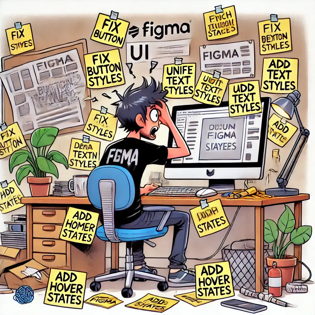
Every UX/UI designer has faced a situation where they had to push a design quickly, knowing that some details were inconsistent or unfinished. Maybe a button style wasn’t aligned with the design system, some text styles were improvised, or interaction states were skipped. These small compromises—though necessary at times—accumulate over time, leading to inconsistent interfaces, usability issues, and frustrating developer handoff. This is what we call design debt.
Just like technical debt in software development, design debt accrues “interest” over time. The longer you ignore inconsistent components, poor documentation, or outdated UI patterns, the harder it becomes to maintain a cohesive and scalable design system. What starts as a small issue—like skipping hover states or misusing typography—can lead to confusing user experiences, misaligned developer implementations, and costly redesigns.
But not all design debt is bad! Sometimes, designers need to prioritize speed over perfection to meet tight deadlines. The key is to recognize when design debt is acceptable and when it becomes a barrier to usability and scalability.
In this article, we’ll explore 20+ real-world examples of design debt in UI/UX, its impact on user experience, and how you can prevent, track, and fix it before it becomes a problem. Whether you’re working in Figma, Adobe XD, or Sketch, these strategies will help you create cleaner, more consistent, and scalable designs—without the long-term debt! 🚀
Examples of Design Debt
For every single example, we’ll discuss the impact of the design debt and provide solutions to fix them. I will use Figma as my reference tool, but as mentioned above, this applies to the other tools too.
Let’s dive in!
1. Inconsistent Design Components in Figma
- Example: Multiple versions of buttons, forms, or cards with minor differences are used across files.
- Debt Impact: Developers build multiple redundant components, increasing code complexity and maintenance cost.
- Solution: Use a shared design system with well-defined components and variants. Create a Figma library with reusable components and styles to maintain consistency.
2. No Naming Convention for Layers and Components
- Example: Layers and frames are called
Frame 55,Rectangle 9, etc. - Debt Impact: Makes collaboration, development handoff, and future updates slower and more error-prone.
- Solution: Define and document a consistent naming convention for layers and components.
3. Outdated Screens or Flows Left in Files
- Example: Old designs are kept in the same pages or Figma files without labeling them as deprecated.
- Debt Impact: Developers or stakeholders might reference outdated UI by mistake.
- Solution: Archive or clearly label outdated flows, and use version control inside Figma.
4. Missing or Incomplete Design Tokens (colors, spacing, typography)
- Example: Colors and spacing values are manually entered instead of using defined styles.
- Debt Impact: Leads to implementation mismatches and inconsistent user experiences.
- Solution: Define and apply styles using Figma’s color, text, and spacing tokens. Align them with the development team’s design tokens.
5. Lack of Component Variants for Different States
- Example: Only default states of UI elements are designed (no hover, focus, disabled, etc.).
- Debt Impact: Developers guess or invent interactions, which may not align with the UX vision.
- Solution: Design and document all interactive states with Figma Variants.
6. No Documentation for Interaction Patterns
- Example: You design a modal or dropdown but don’t include how it behaves (e.g., animation, keyboard navigation).
- Debt Impact: Developers build inconsistent interactions or miss accessibility concerns.
- Solution: Add tooltips, notes, or use Figma’s
CommentsorFigJamfiles to document behavior clearly.
7. Lack of Accessibility Considerations in Design
- Example: Color contrast, focus outlines, or readable font sizes are ignored.
- Debt Impact: Causes usability and legal issues, increases future design + dev rework.
- Solution: Use Figma plugins like
Able,Contrast, orStarkto test accessibility during design.
8. Designing Without a Grid or Layout System
- Example: Elements are placed freely on the canvas without any alignment or grid.
- Debt Impact: Developers struggle to interpret spacing, leading to inconsistencies and extra dev effort.
- Solution: Use Figma layout grids and constraints to create responsive, scalable layouts.
9. Redundant Files for Each Screen Size or Platform
- Example: Instead of using responsive/resizable components, you copy-paste screens for desktop, tablet, mobile.
- Debt Impact: Hard to maintain and sync changes across breakpoints.
- Solution: Design components responsively using constraints and auto-layout.
10. No Developer Handoff Preparation
- Example: No use of design tokens, missing spacing values, poor file organization before sharing with developers.
- Debt Impact: Developers spend extra time trying to interpret designs, leading to errors and misunderstandings.
- Solution: Use Figma’s
Inspectpanel, style tokens, and well-structured pages for efficient handoff.
11. Not Using Auto Layout
- Example: Designers manually space and align elements.
- Debt Impact: Developers struggle to maintain consistency, especially in responsive views.
- Solution: Use Auto Layout in Figma for dynamic, scalable UIs.
12. Ignoring Platform-Specific Guidelines
- Example: Designing mobile apps without following iOS or Android conventions.
- Debt Impact: Increases cognitive load and leads to poor UX.
- Solution: Familiarize yourself with Human Interface Guidelines (iOS) and Material Design (Android).
13. Exporting Incorrect or Unoptimized Assets
- Example: Designers export assets in the wrong size or format (e.g., blurry icons, huge images).
- Debt Impact: Impacts performance and design integrity.
- Solution: Use Figma export presets, SVGs for icons, and @2x/@3x PNGs for raster images.
14. Ignoring Design Review Cycles
- Example: Skipping peer reviews or validation steps before handoff.A team manually deploys changes via FTP or SSH instead of using a CI/CD pipeline.
- Debt Impact: Bugs, accessibility issues, and inconsistencies slip through to development.
- Solution: Include design QA, peer reviews, and validation rounds before delivery.
15. Not Keeping Design Tokens in Sync with Code
- Example: Design tokens change in Figma, but developers are unaware.
- Debt Impact: Visual drift between design and production.
- Solution: Use tools like Figma Tokens, Style Dictionary, or Design System automation to sync changes with code.
Conclusion: Taming Design Debt for Scalable and Consistent UI/UX
Design debt is unavoidable, but it doesn’t have to be unmanageable. Every UI/UX team makes trade-offs—whether it’s skipping documentation, rushing a new feature, or reusing outdated components. The real challenge isn’t avoiding debt altogether—it’s knowing when to take shortcuts and when to clean up before it spirals out of control.
The longer you wait to address it, the more costly and time-consuming it becomes. But with clear guidelines, regular audits, and a well-maintained design system, you can create high-quality, scalable, and future-proof UI/UX experiences—without getting buried under a mountain of sticky notes and last-minute fixes.
FAQ about Design Debt
Design debt is indeed a real and recognized concept, although it's often considered a subset of technical debt. Technical debt refers to compromises in the codebase or system architecture that create future rework. Design debt refers to compromises in the user interface, experience, consistency, and documentation that similarly lead to more effort in future updates. Think of design debt as the UX/UI version of technical debt.
Share article